


Before we start creating a react form with formik and tailwindcss, I'd like to talk a bit about formik.
Formik
Formik is a small react component made up of hooks for creating and validating react forms painlessly. By using formik you can handle form responses, validate the values before sending it to servers or your APIs.
A comprehensive documentation as regards formik is just one click away: Formik. So back to the main content of this blog post, we'll be leveraging the power of formik in creating a react form, including it's validation. Tailwindcss would be our CSS framework for faster development.
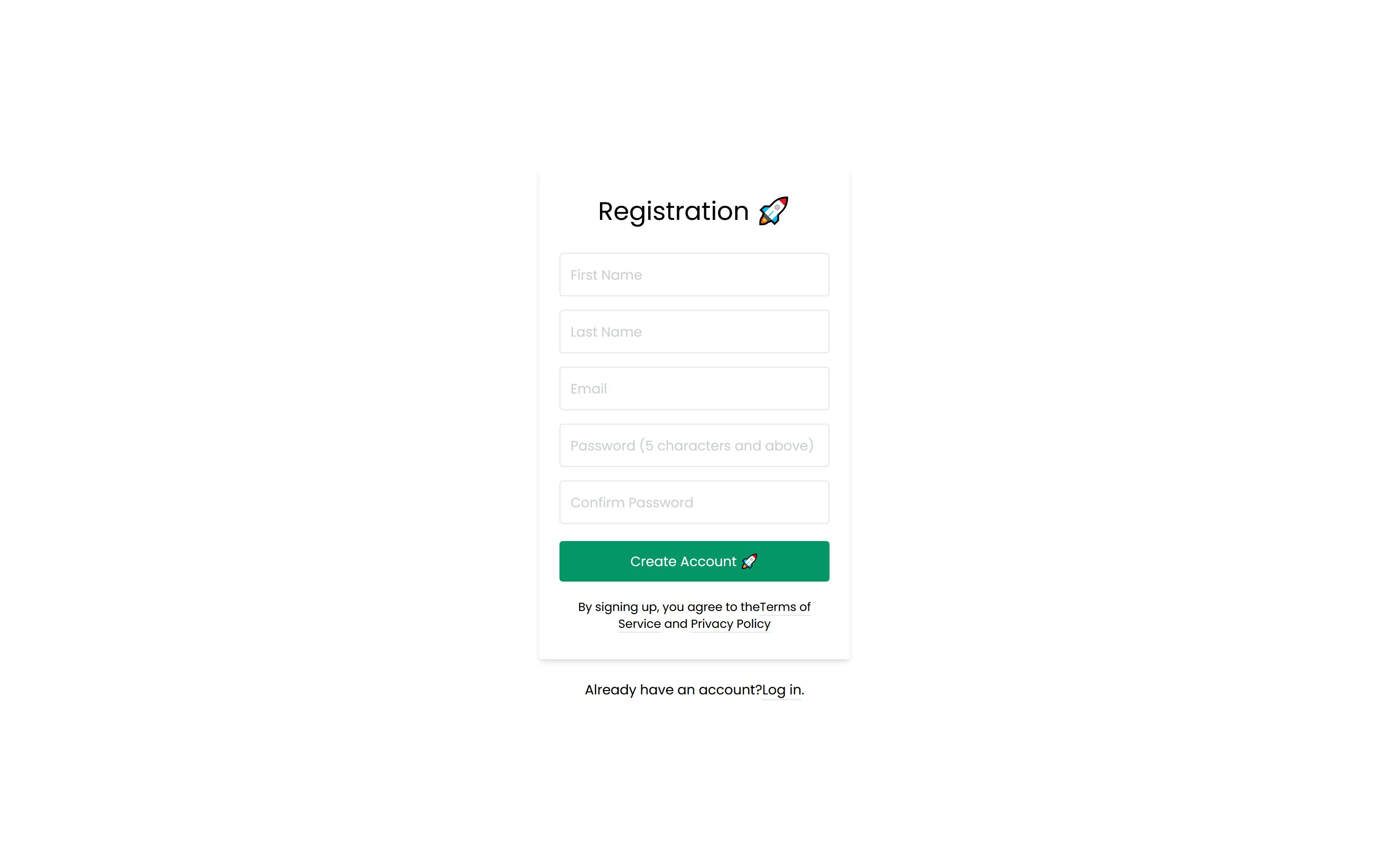
Final Output of what we'll be building: Formik Form
Let's get started...
Since formik is a small react component, we'll need to create a new react app and then install formik which will grant us access to formik hooks and all.
npx create-react-app sampleform
Once creation is complete, proceed to installing Formik and TailwindCSS in your react app.
npm install formik --save
The command above will install formik into your react app. Now let's add tailwindcss
npm install tailwindcss postcss autoprefixer
This will install tailwindcss, postcss and autoprefixer into our app and of which, needs it's setup. Navigate to the root directory of your react app and create a file called postcss.config.js and add this block of code
module.exports = {
  plugins: {
    tailwindcss: {},
    autoprefixer: {},
  }
}
Finally, we'll need a tailwind.config file for our setup to be complete, and
npx tailwindcss init
will automatically generate a config file for us of which we can tweak if we want but let's leave it as default. Navigate to your App.js file and import tailwindcss:
import "tailwindcss/dist/tailwind.css";
Now our basic setup is done.
Creating the Form
Since React is a component based library, we'll process in creating a file called MyForm.js then copy and paste this code into MyForm.js
import React from "react";

function MyForm() {
  return (
    <form>
      <div className="bg-grey-lighter min-h-screen flex flex-col">
        <div className="container max-w-sm mx-auto flex-1 flex flex-col items-center justify-center px-2">
          <div className="bg-white px-6 py-8 rounded shadow-md text-black w-full">
            <h1 className="mb-8 text-3xl text-center">Registration 🚀</h1>
            <input
              type="text"
              className="block border border-grey-light w-full p-3 rounded mb-4"
              name="firstName"
              placeholder="First Name"
            />

            <input
              type="text"
              className="block border border-grey-light w-full p-3 rounded mb-4"
              name="lastName"
              placeholder="Last Name"
            />

            <input
              type="text"
              className="block border border-grey-light w-full p-3 rounded mb-4"
              name="email"
              placeholder="Email"
            />

            <input
              type="password"
              className="block border border-grey-light w-full p-3 rounded mb-4"
              name="password"
              placeholder="Password (5 characters and above)"
            />

            <input
              type="password"
              className="block border border-grey-light w-full p-3 rounded mb-4"
              name="Vpassword"
              placeholder="Confirm Password"
            />

            <button
              type="submit"
              className="w-full text-center py-3 rounded bg-green-600 text-white hover:bg-green-dark focus:outline-none my-1"
            >
              Create Account 🚀
            </button>

            <div className="text-center text-sm text-grey-dark mt-4">
              By signing up, you agree to the
              <a
                className="no-underline border-b border-grey-dark text-grey-dark"
                href="#"
              >
                Terms of Service
              </a>{" "}
              and{" "}
              <a
                className="no-underline border-b border-grey-dark text-grey-dark"
                href="#"
              >
                Privacy Policy
              </a>
            </div>
          </div>

          <div className="text-grey-dark mt-6">
            Already have an account?
            <a
              className="no-underline border-b border-blue text-blue"
              href="../login/"
            >
              Log in
            </a>
            .
          </div>
        </div>
      </div>
    </form>
  );
}

export default MyForm;
Actually this is a basic tailwindcss form, no plain css attached to give us such a nice form. Now let us display this form to our users. Navigate to your App.js and clear the default react js code and replace with your form. So your App.js will look much like this
import './App.css';
import "tailwindcss/dist/tailwind.css";
import MyForm from './MyForm';

function App() {
  return (
    <div className="App">
      <MyForm />
    </div>
  );
}

export default App;
Then
npm start
to view your app.
Sample output:
Now, our form is ready.... Let's proceed in validating user inputs and allowing users enter values into our form.
First create a file called validate.js which we will use later to validate users input. And in that file, paste this block of code
const validate = (values) => {
  const errors = {};
/* validating first name */
  if (!values.firstName) {
    errors.firstName = "First name is required";
  } else if (values.firstName.length < 1) {
    errors.firstName = "Invalid First name";
  } else {
    errors.firstName = "Nice first name 😃";
  }

/* validating last name */
  if (!values.lastName) {
    errors.lastName = "Last name is required";
  } else if (values.lastName.length < 1) {
    errors.lastName = "Invalid Last name";
  } else {
    errors.lastName = "Awesome last name 😁";
  }

/* validating email using regex to pass email */
  if (!values.email) {
    errors.email = "Email address is required";
  } else if (!/^[A-Z0-9._%+-]+@[A-Z0-9.-]+\.[A-Z]{2,4}$/i.test(values.email)) {
    errors.email = "Invalid email address";
  }

/* validating passwords */
  if (!values.password) {
    errors.password = "Password is required";
  } else if (values.password.length <= 6) {
    errors.password = "Password length is weak 😩";
  } else {
    errors.password = "Password strength is ok 💪";
  }

/* validating password verification with initial */
  if (!values.Vpassword) {
    errors.Vpassword = "Invalid password verification";
  } else if (values.Vpassword !== values.password) {
    errors.Vpassword = "Passwords don't match 😟";
  } else {
    errors.Vpassword = "Passwords match 👏";
  }

  return errors;
};

export default validate;
Navigate to MyForm.js and import a formik hook called useFormik
import { useFormik } from "formik"
The useFormik hook accepts initial values and a submit function for form submission. Add this block of code right above your return statement in MyForm.js
const formik = useFormik({
    initialValues: {
      firstName: "",
      lastName: "",
      email: "",
      password: "",
      Vpassword: "",
    },
    onSubmit: () => {
      console.log();
    },
  });
We'll like our users to enter values into the field. With the getFieldProps from formik, we can easily handle onChange, onBlur, value and checked option.
Now navigate to each input field in MyForm.js and add this code right after the placeholder section replacing the word in the bracket with the name of the field you are targeting:
{...formik.getFieldProps("FIELD NAME")}
After which your whole app would look like this below:
import React from "react";
import { useFormik } from "formik";

function MyForm() {
  const formik = useFormik({
    initialValues: {
      firstName: "",
      lastName: "",
      email: "",
      password: "",
      Vpassword: "",
    },
    onSubmit: () => {
      console.log();
    },
  });
  return (
    <form onSubmit={formik.handleSubmit}>
      <div className="bg-grey-lighter min-h-screen flex flex-col">
        <div className="container max-w-sm mx-auto flex-1 flex flex-col items-center justify-center px-2">
          <div className="bg-white px-6 py-8 rounded shadow-md text-black w-full">
            <h1 className="mb-8 text-3xl text-center">Registration 🚀</h1>
            <input
              type="text"
              className="block border border-grey-light w-full p-3 rounded mb-4"
              name="firstName"
              placeholder="First Name"
              {...formik.getFieldProps("firstName")}
            />

            <input
              type="text"
              className="block border border-grey-light w-full p-3 rounded mb-4"
              name="lastName"
              placeholder="Last Name"
              {...formik.getFieldProps("lastName")}
            />

            <input
              type="text"
              className="block border border-grey-light w-full p-3 rounded mb-4"
              name="email"
              placeholder="Email"
              {...formik.getFieldProps("email")}
            />

            <input
              type="password"
              className="block border border-grey-light w-full p-3 rounded mb-4"
              name="password"
              placeholder="Password (5 characters and above)"
              {...formik.getFieldProps("password")}
            />

            <input
              type="password"
              className="block border border-grey-light w-full p-3 rounded mb-4"
              name="Vpassword"
              placeholder="Confirm Password"
              {...formik.getFieldProps("Vpassword")}
            />

            <button
              type="submit"
              className="w-full text-center py-3 rounded bg-green-600 text-white hover:bg-green-dark focus:outline-none my-1"
            >
              Create Account 🚀
            </button>

            <div className="text-center text-sm text-grey-dark mt-4">
              By signing up, you agree to the
              <a
                className="no-underline border-b border-grey-dark text-grey-dark"
                href="#"
              >
                Terms of Service
              </a>{" "}
              and{" "}
              <a
                className="no-underline border-b border-grey-dark text-grey-dark"
                href="#"
              >
                Privacy Policy
              </a>
            </div>
          </div>

          <div className="text-grey-dark mt-6">
            Already have an account?
            <a
              className="no-underline border-b border-blue text-blue"
              href="../login/"
            >
              Log in
            </a>
            .
          </div>
        </div>
      </div>
    </form>
  );
}

export default MyForm;
Now we are almost done!!! Let's make use of our validation file by importing it into MyForm.js, then updating our form errors by reminding our users which field is required or not up to requirement. Remember too that I mentioned that the getFieldProps() from formik handles onBlur and onChange, so we are going to make use of it's power in displaying errors to our user while they enter values in an input field and also when they tab away (onBlur).
So import the validate file into MyForm.js and pass validate right above the onSubmit because we want to verify before submitting. Your code should look like this:
import React from "react";
import validate from "./validate";
import { useFormik } from "formik";

function MyForm() {
  const formik = useFormik({
    initialValues: {
      firstName: "",
      lastName: "",
      email: "",
      password: "",
      Vpassword: "",
    },
    validate,
    onSubmit: (values) => {
      console.log(values);
    },
  });
After this, pass formik.handleSubmit to your form since we are relying on formik to get our work done:
<form onSubmit={formik.handleSubmit}>
Lastly, let's update our error display to users. This code below when placed right after the input field we want an error to be displayed should do the trick
 {formik.touched.FIELD-NAME && formik.errors.FIELD-NAME ? (
              <div>{formik.errors.FIELD-NAME}</div>
            ) : null}
Let me explain a bit of what the code above does before showing you the overall code output... We gained access to the touched option from the getFieldProps() we passed to individual input. Remember I said earlier that getFieldProps gave us access to the onBlur call right? That's the same as touched in formik.
So the error log in simple term reads:
If the user tabs away from the input field and the input field contains an error, display the error for that field else display nothing :)
Hope that makes sense now?
So after the above guide, your final output should look like this below:
import React from "react";
import validate from "./validate";
import { useFormik } from "formik";

function MyForm() {
  const formik = useFormik({
    initialValues: {
      firstName: "",
      lastName: "",
      email: "",
      password: "",
      Vpassword: "",
    },
    validate,
    onSubmit: (values) => {
      console.log(values);
    },
  });
  return (
    <form onSubmit={formik.handleSubmit}>
      <div className="bg-grey-lighter min-h-screen flex flex-col">
        <div className="container max-w-sm mx-auto flex-1 flex flex-col items-center justify-center px-2">
          <div className="bg-white px-6 py-8 rounded shadow-md text-black w-full">
            <h1 className="mb-8 text-3xl text-center">Registration 🚀</h1>
            <input
              type="text"
              className="block border border-grey-light w-full p-3 rounded mb-4"
              name="firstName"
              placeholder="First Name"
              {...formik.getFieldProps("firstName")}
            />
            {formik.touched.firstName && formik.errors.firstName ? (
              <div>{formik.errors.firstName}</div>
            ) : null}

            <input
              type="text"
              className="block border border-grey-light w-full p-3 rounded mb-4"
              name="lastName"
              placeholder="Last Name"
              {...formik.getFieldProps("lastName")}
            />
            {formik.touched.lastName && formik.errors.lastName ? (
              <div>{formik.errors.lastName}</div>
            ) : null}

            <input
              type="text"
              className="block border border-grey-light w-full p-3 rounded mb-4"
              name="email"
              placeholder="Email"
              {...formik.getFieldProps("email")}
            />
            {formik.touched.email && formik.errors.email ? (
              <div>{formik.errors.email}</div>
            ) : null}

            <input
              type="password"
              className="block border border-grey-light w-full p-3 rounded mb-4"
              name="password"
              placeholder="Password (5 characters and above)"
              {...formik.getFieldProps("password")}
            />
            {formik.touched.password && formik.errors.password ? (
              <div>{formik.errors.password}</div>
            ) : null}

            <input
              type="password"
              className="block border border-grey-light w-full p-3 rounded mb-4"
              name="Vpassword"
              placeholder="Confirm Password"
              {...formik.getFieldProps("Vpassword")}
            />
            {formik.touched.Vpassword && formik.errors.Vpassword ? (
              <div>{formik.errors.Vpassword}</div>
            ) : null}

            <button
              type="submit"
              className="w-full text-center py-3 rounded bg-green-600 text-white hover:bg-green-dark focus:outline-none my-1"
            >
              Create Account 🚀
            </button>

            <div className="text-center text-sm text-grey-dark mt-4">
              By signing up, you agree to the
              <a
                className="no-underline border-b border-grey-dark text-grey-dark"
                href="#"
              >
                Terms of Service
              </a>{" "}
              and{" "}
              <a
                className="no-underline border-b border-grey-dark text-grey-dark"
                href="#"
              >
                Privacy Policy
              </a>
            </div>
          </div>

          <div className="text-grey-dark mt-6">
            Already have an account?
            <a
              className="no-underline border-b border-blue text-blue"
              href="../login/"
            >
              Log in
            </a>
            .
          </div>
        </div>
      </div>
    </form>
  );
}

export default MyForm;
Now test your app.
You can as well tweak the error message from the validate file to fit what you want.
Note: A small library called Yup is available too in case you need some sort of quick validation. I'll write about Yup in my next article but for the mean time, enjoy the power of formik and your custom validation
Final Output URL: formikform.netlify.app
Github Repo: github.com/Veri5ied/formik-form